Text Box
Text box is useful for getting input from users and displaying it.
Design
Under design tab on the right hand menu you can find the visibility and style options of the text box.
Size
Large, Big, Medium, and Small options are listed. Selecting one of these will shrink or fit the text box into its container.
Place Holder
Any text in this area will be written as faded in the text box when it is empty.
Hints
The text in this area pops up when you hover text box.
Type
Specify the type of text box as text, password, email, search, and url. According to this type parameter a related icon shows up on the leftmost of text box. In addition when password type is selected, the input is displayed as star characters.
Rules
Required for Group
Enter any name into this area to specify a validation group for the text box. After that when you enter this same validation group name into Validation Group area on any action button of any task, it will be checked for validation whenever the action is selected on the form.
Maximum Length
Allowed maximum length of text value.
Input Mask
Allowed input mask. You should use 9 for [0-9], a for [a-Z], * for [0-a-Z].
Dynamic Rules
Through this button you can add two types of rules to the text box control. Click one of them and you will see it is listed above the button. It has two buttons to edit and delete the rule.
-
Formatting rules, allow you to change the formats (text color, background color, style) and visibility of a control depending upon a condition. Further information here
-
Validation rules, allow you to validate the data that is entered by the end-user. Further information here
Data
Bound Xpath
Changes XPath of the text box.
Other Properties
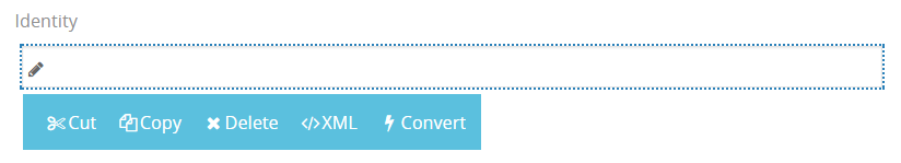
- Cut is used to move control.
- Copy is used to copy control.
- Delete is used to delete control.
- XML is used to view and edit xml of the control.
- Convert is used to change content control into other controls.