Column
Columns are used in Row Layout Content to build a grid layout. In default there is only one column in each content and its width is set to fill whole width of its parent.
Design
Align
Adjusts the alignment of the column with respect to its parent.
Width
A row content is assumed to have a maximum width of 12 columns in total. Conforming to this, a column may have a width of 1 to 12 columns. If "inherit from smaller" option is selected, it inherits the width from the configuration for the smaller device, which is specified at responsive layout section.
Responsive Layout
Defines how the column is going to be displayed on mobile device screens. It provides width option selection for desktop, landscape and portrait orientations of a tablet and a regular mobile phone. Landscape orientation of tablet is the default width which is defined in the previous section.
Data
Bound Xpath
XPath of the element. If set to empty, it uses parent xpath.
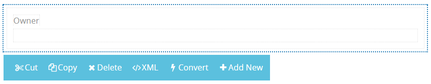
Other Properties
- Cut is used to move control.
- Copy is used to copy control.
- Delete is used to delete control.
- XML is used to view and edit xml of the control.
- Convert is used to change content control into other controls.
- Add new is used to add the new column.