Radio List
This control creates a radio list element.
Design
Size
Large, Big, Medium, and Small options are listed. Selecting one of these will shrink or fit the radio list into its container.
Hints
The text entered in this area pops up when you hover the field.
Rules
Required for Group
This section is useful for giving a section a name to mark it as required when taking a specific action. When required for group section is filled for any element or section in the form, system doesn't let one to leave it empty and displays a warning. Setting a rule by clicking on any action on the process diagram and entering its name into the validation group field from the right side menu will require this section to be filled.
Format
Define the way how datetime to be displayed. It can be displayed as only date, only time or both.
Dynamic Rules
Dynamic rules section allows to specify format and warning messages of any element and section. Dynamic rules section consists of two parts, one of them is for formatting rules and the other one is for validation rules.
-
Formatting rules, allow you to change the formats (text color, background color, style) and visibility of a control depending upon a condition. Further information here
-
Validation rules, allow you to validate the data that is entered by the end-user. Further information here
Data
Bound XPath
XPath of the element. If set to empty, it uses parent xpath.
Value XPath
XPath to store selection value.
Caption XPath
XPath to store selection text value.
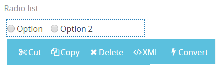
Other Properties
- Cut is used to move control.
- Copy is used to copy control.
- Delete is used to delete control.
- XML is used to view and edit xml of the control.
- Convert is used to change content control into other controls.