Row Content
A control container that fills all width. Row content may also contain one or more columns to build a grid layout. Row content also provides responsive layouts for small devices and may change columns to fit all controls.
For row content you can configure following properties:
Design
Label
Label to show top of row. If set to empty title is not visible at running form.
Type
Type of row layout. When selected as a "Section" row style is changed to section layout.
When section type is selected, a new menu, named Collapsing, shows.
Collapsing
This feature allows you to display a section as expanded or collapsed.
- Expanded : Section loads as opened on the form. You can collapse it with arrow icon.
- Collapsed : Section loads as closed on the form. You can expand it with arrow icon.
Bold
will be update
Italic
will be update
Text Color
will be update
Background Color
will be update
Rules
Section Name
Name of section is for controlling read only or visible state of a section. After setting value, you can configure section in task properties.
Dynamic Rules
Dynamic rules section allows to specify format and warning messages of any element and section. Dynamic rules section consists of two parts, one of them is for formatting rules and the other one is for validation rules. * Formatting rules, allow you to change the formats (text color, background color, style) and visibility of a control depending upon a condition. Further information here.
- Validation rules, allow you to validate the data that is entered by the end-user. Further information here.
Data
Bound Xpath
XPath of the element. If set to empty, it uses parent xpath.
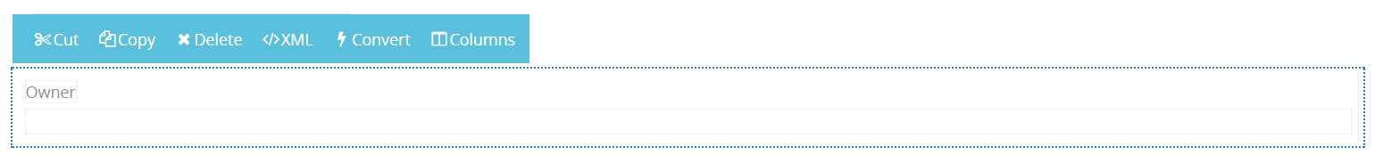
Other Properties
- Cut is used to move row layout content.
- Copy is used to copy row layout content.
- Delete is used to delete row layout content.
- XML is used to view or add xml of the row layout content.
- Convert is used to change row layout content to other content controls those are database query, XML database query, conditional content, tabbed layout content, static panel, guide message, flow layout content, activity stream, expression, XSL transform, Html or label.
- Columns is used to divide row layout content to element section.